January 28, 2024

ABA Graphs and Visual Analysis: Types, Elements, and Examples

Author:
Katherine Jester, MS, BCBA, LBA
ABA Graphs & Visual Analysis

Visual analysis translates data into insights. Learn how therapists use ABA graphs to analyze a client’s treatment. Explore types of graphs and which to use when, get expert best practices, and discover how electronic graphing can help you provide the best quality care.

Inside this article:

How Do We Use Graphs in ABA?

ABA professionals use graphs to track behavior over time and evaluate the success of a treatment. Analyzing graphs helps them determine if they should adjust the plan. ABA professionals also use graphs to communicate progress to stakeholders like parents and insurance payors.

Graphing plays a role in almost every stage of behavioral analysis, from analyzing behavior baseline data to monitoring the effectiveness of any program. In Applied Behavior Analysis (ABA), trained BCBAs, RBTs, and other clinicians create graphs to visualize data they collect as part of behavior intervention plans or skill acquisition programs. Clinicians use graphs to represent continuous measurement and discontinuous measurement data, the two main data groups in ABA. Then, they use visual analysis to identify trends and patterns that help inform programming decisions.

For example, graphs help therapists answer specific questions like "How long does this behavior last?" or "Has the behavior intervention plan or skill training resulted in an increase in the target behavior?"

Graphs are also critical in the billing and insurance process. “Many insurance payors require charts and graphs to justify treatment,” says Balaji (Bala) Ramani, Vice President of Business Development at Plutus Health Inc. Bala has several years of experience in building high-impact and successful marketing and sales teams. He works on ABA billing and software for Plutus Health Inc.

Balaji (Bala) Ramani, Vice President of Business Development at Plutus Health Inc

"If the patient's family and the clinic are seeking insurance funding, the clinic must receive pre-authorization for the treatment plan. As part of this process, most payers mandate that the clinic includes a relevant graph that shows the child's baseline data as part of their explanation for why the child needs a specific treatment or intervention. These authorizations typically expire in six months. After that, you must submit a renewal for funding with charts and graphs that show the child's progress," explains Bala

Overall, visual analysis is critical for the billing and clinical aspects of ABA. Understanding how to collect data, plot it with an appropriate graph, and conduct visual analyses are essential skills in ABA.

Key Takeaways

  • ABA professionals plot data on graphs and use visual analysis to identify patterns.
  • All insurance payors require that ABA clinics submit graphs as part of pre-authorization and treatment renewal.
  • The most common graph in ABA is a line graph that demonstrates how a variable changes over time.
  • Electronic data collection and graphing software is the best, most effective, and most accurate way to conduct ABA visual analysis.
  • When selecting electronic data collection tools, look for fully integrated, end-to-end practice management software.

Why is Graphing Important in ABA

Graphs in ABA are the most effective way to show quickly how a child has improved or changed from their baseline data. They help therapists make informed programming decisions to create custom plans for the patient. Many insurance payors require you to submit a graph to pre-authorize or continue treatment.

April Torres, M.Ed., BCBA

April Torres, M.Ed., BCBA., says graphs help guide BCBAs when making programming decisions. "When we're figuring out how to adjust a program or if we're unsure about a patient's needs, we can graph the data we have," she explains. "It gives us a visual snapshot of what's going on. Plus, graphs can help us confirm or reject our assumptions. For example, we might think a patient is improving, but an accurate graph of the relevant data will ultimately tell us for sure."

Graphs also help BCBAs explain a child’s behavior to other key stakeholders like doctors, parents, or even the child themselves. "We often use graphs to communicate with people outside of ABA," Torres points out. "Using graphs makes it easier to explain trends. For example, we can say something like, 'This behavior usually goes up around 7 PM,' and show them a visual graph that illustrates the data. It also helps us share information with other clinicians working with the same child."

These visual aids can be an undeniable source of confidence for parents and help motivate them to implement the behavior plan at home continually. “Parents obviously want to stay up to date on their child’s progress,” adds Bala. “They can glean a lot of information from a straightforward line graph based on the direction and the slope of the line. Other graphs like bar graphs and scatterplots also show them information quickly.”

Bala continues, explaining that the graphs not only give the parents an idea of their child’s progress but also show if what they’re doing at home is helping. “Often, clinicians train the parents to implement a similar intervention as part of their daily life at home. When the child improves, a graph of the data will demonstrate very clearly that the parent’s interactions are helping contribute to this progress. This feeling can be incredibly validating for parents who want to be actively involved in their child’s treatment.”

Graphing is becoming even more important as many payers shift towards a “value-based” payment model designed to incentivize providers to focus on the quality of their service. Under this model, payers compensate the ABA clinic and its providers based on the patient’s outcomes or the treatment’s effectiveness.

"The move towards value-based models comes from the reality that ABA supervisors are often quite busy. Sadly, they can't always keep a close eye on every child's progress and how they respond to different situations," explains Bala. "This situation may go on for too long, and the treatment might persist even if the child isn't making progress. Insurance providers have noticed this problem, prompting them to scrutinize claims and pre-authorization forms more closely to ensure the treatment is effective and medically necessary."

Key Elements in an ABA Graph

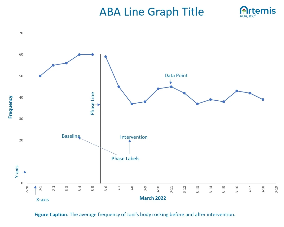
Most ABA graphs have two types of data: behavior and time. ABA professionals plot the behavior data on the y-axis and the date on the x-axis. They also add labels to indicate important events, like the start of an intervention or a change in medication.

ABA professionals choose the graph format that will best illustrate the type of data they hope to plot. There are many types of graphs that we use regularly in ABA, but they all have some common elements:

  • Data points: Data points populate the graph and use "independent" and "dependent" variables. The names indicate how the data interrelates. Independent variables have unchanging values unrelated to the other variables. On the other hand, dependent variables vary based on the values of independent variables.

    In ABA graphs, behavior data is the dependent variable, while date data is the independent variable. The behavior data changes with the date, but the date remains unaffected by the behavior data.

  • The x-axis and the y-axis: On any graph, the x-axis is the horizontal axis, and the y-axis is the vertical axis. We plot the dependent variables on the y-axis and the independent variables on the x-axis. For ABA, we plot the date or time on the x-axis and the behavior data points on the y-axis.

    We represent data based on their relative coordinates on the x-axis and the y-axis as (x, y). The formal name of the x-coordinate is the "abscissa,"" and the formal name of the y-coordinate is the "ordinate."

  • Axis labels: Axis labels serve as titles for the x-axis and the y-axis. For instance, in a standard frequency line graph, the x-axis label could be "Observation date" or simply "Date," while the y-axis label might be "Frequency data" or just "Frequency." The general rule of thumb is to keep labels concise and contextual.

  • Phase, phase line, and phase labels: In ABA, a "phase" defines a distinct segment of a behavior intervention plan or study. For example, gathering baseline data represents one phase, while implementing an intervention plan represents another.

    To designate a phase on a graph, we use a "phase line" or "phase change line," also known as "condition change lines." These vertical lines span the entire graph height, dividing it into distinct sections corresponding to each phase. BCBAs use phase lines to accurately account for external effects that could influence the data, like the beginning of an intervention plan or a change in medication. Without phase lines, you could misinterpret a change in the behavior data. For example, a student’s behavior might suddenly shift because they started a new medication. Without a phase change line indicating medication change, you might misattribute the cause of the behavior change and adjust your plan based on a misinterpretation of the data.

    Phase labels title each graph section with the corresponding phase name, serving as the phase's title. Typically, clinicians place the phase title above the phase line, just below the graph title.

  • Figure caption: A figure caption summarizing the graph is typically below the x-axis label. You can also include a brief interpretation of any key findings in the figure caption.

  • Graph title: The title describes the graph's contents appears above the graph. Most people like to bold or center their title to distinguish it from other text in the graph. Succinct but comprehensive titles work best. There's no industry standard governing graph titles, but one common guideline is to use nine words or less.

ABA Line Graph

Types of ABA Graphs

There are two categories of ABA graphs: equal interval graphs and non-equal interval graphs. These encompass popular graph types such as line graphs, scatterplots, and logarithmic charts. The standard celeration chart is the only type of non-equal interval graph.

Equal and non-equal interval graphs plot the independent variables on the y-axis differently. In an equal interval graph, the y-axis points have a consistent and equal interval between them. For instance, a frequency y-axis might progress in units of two, such as zero, two, four, six, and eight, maintaining a consistent interval.

In contrast, non-equal interval graphs don’t maintain a uniform interval between y-axis points. These graphs prove useful when displaying a broad range of y-values within a single chart. The most prevalent type of non-equal interval graph involves transforming y-axis values onto a logarithmic scale.

In practice, ABA therapists almost exclusively use equal-interval graphs. But it’s important to understand how to plot, read, and analyze all the graphs you might find in ABA.

Here are specific definitions and examples of all the major ABA graphs:

  • Equal interval graphs

    • Line graphDescription: A line graph connects each data point with a line to illustrate trends and changes over time. Line graphs are the most common type of graph in ABA because they are a great way to visualize how a numerical variable successively changes over time.
      When to use: Use a line graph to show a trend and change of a single variable. Line graphs measure how a behavior variable changes, either a discontinuous or continuous variable, like frequency of behavior over time. RBTs and BCBAs also use line graphs to visualize a student's progression, like in discrete trial training.

      You can also use line graphs to plot multiple behaviors on the same graph. For instance, track how often a student has temper tantrums and how often they hit others on one graph. Just label everything clearly so it's easy to understand.

    • Cumulative recordDescription: A cumulative record graph is a type of line graph used to depict a student's progress in a particular task over a period of time. Cumulative graphs plot the cumulative total of something over time.
      When to use: The cumulative record graph is ideal for tracking and displaying the development of a skill. It illustrates the frequency of a specific behavior across various sessions. The graph's slope provides insights into the rate of adoption. A positive slope indicates increased adoption of the target behavior.

      By the end of the observation period, the graph reflects the cumulative total, enabling BCBA or RBT professionals to gauge how rapidly a student is mastering a new behavior and demonstrating their fluency. Fluency measures the accuracy and speed with which a student performs a task. If a student consistently responds correctly and swiftly, they exhibit fluency in that task. A cumulative interval graph is crucial for assessing a student's fluency gain.

      For instance, in a common skill acquisition program like "tacting" an item, the RBT can use a cumulative record graph to track the learner's progress in each session. After collecting baseline data, they can observe the student's improvement in that specific task.

      "I turn to a cumulative graph whenever I want to understand a child's progress in learning new skills," shares Torres, BCBA. "For instance, I frequently use this graph to showcase the number of skills a student is mastering over time. The graph becomes especially insightful if a student hits a plateau. Let's say they learn 20 skills in January and 30 more in February, but by March, the cumulative number stays at 30. That signals a plateau and prompts me to investigate what might have caused this change."

      Graph
    • ScatterplotsDescription: A scatterplot shows the distribution of single data points within the graph.
      When to use: Use a scatter plot to display the relationships between two data variables.

      In an ABA setting, BCBAs use scatterplots to help identify relationships between two variables. Usually, one of the variables measures behavior. For example, a therapist might use a scatterplot to plot how the frequency of a behavior changes with a different class size. You can plot the class size on the x-axis and frequency on the y-axis. Then, you can assess how the frequency of behavior changes as you increase or decrease the class size.

      Graph
    • Bar graphsDescription: Bar graphs summarize and compare the same type of data for different categorical groups of subjects or conditions. In a bar graph, each category or group has a separate bar. The bar height corresponds to the value of the variable on the y-axis.
      When to use: Opt for a bar graph to compare discrete groups or categories within diverse ABA scenarios. For instance, plot each student's name on the x-axis and average frequency on the y-axis to assess and compare the frequency of a specific behavior among students. Then, use a bar to represent each student's average frequency, allowing for easy comparison between students.

      Bar graphs are also helpful in other settings. For example, graph how often a single student selects an object to determine which they prefer the most. In this case, the object is on the x-axis, and the y-axis depicts how frequently the student chooses that item or another variable measuring preference.

      "Bar graphs aren't a usual go-to in BCBA," notes Torres. "But they come in handy when you need to communicate a trend or data to someone, like a parent, not well-versed in ABA. They're visually straightforward and make it easy for anyone to understand a trend or pattern."

      Graph
  • Non-equal interval graphs

    • Standard celeration chart Description: A standard celeration chart (SCC) is a type of semilogarithmic graph. A semilogarithmic graph has both linear and logarithmic axes. The SCC has four axes so that you can plot a behavior's frequency during different observation periods for up to 140 weeks, or around half a school year.

      The SCC is a very complex graph, and it takes time to understand how to read and use it. Below, we provide an overview of the SCC graph. To gain an in-depth understanding of using and interpreting this graph, we recommend consulting an expert or trying to gain practical experience.

      Here's more about the vertical and horizontal axes:

      • Vertical axes represent a behavior frequency and the counting time (length of observation periods)

        The left vertical axis label is “count per minute” and ranges from .001 to 1000 counts per minute. The graph uses a logarithmic scale, which visualizes not just the size of the change but their relative significance. So, going from five to ten will be visually comparable to going from one to five. This frequency scale allows us to chart behaviors that occur once every 24 hours or as often as 1000 times every minute.

        The right vertical axis expresses counting times in hours, minutes, and even seconds. The counting time shows how much time you spend observing and recording behavior. Some also call it the “record floor.” Use a horizontal mark on the graph to show the time you spent recording the minimum frequency for that counting period, and where the maximum period is. We draw the counting floors and ceilings in horizontal lines on the graph.

      • Horizontal axes represent time

        The top horizontal scale represents calendar weeks, and the bottom scale represents calendar days. The chart has 140 weeks, almost half of a school year. This setup gives every frequency on every day a spot so that we can plot a learner's performance very methodically.

      When to use: To determine the child's celeration or fluency: Use a SCC to determine fluency or the rate at which a student is learning over time.

      Specifically, a celeration chart allows you to measure "celeration" periods, whose unit is "count/minute/week," or count per minute per week. When a behavior increases, the celeration is positive; when it's decreasing, it is negative. The counting record feature of the graph is on its left axis. By marking the record ceiling and the record floor, we can plot and compare data from different observation periods because we are standardizing it by the counting time.

      To measure multiple behaviors and get a holistic understanding: We can use the logarithmic scales to measure behavior types with different frequencies on the same graph. We can also plot "celeration" goals and see how the student progresses. For example, if we have a student who is aggressive, we can plot all the behaviors related to aggression, perhaps temper tantrums, screaming, and hitting other students. By accurately assessing them on a single graph, we can gain a holistic understanding of the student's behavior. When you have someone trained to do it: "It's unusual to see a clinician formally using the SCC in ABA sessions," explains Torres. “Many times, multiple people are working on a single child. It's unlikely that both will be well-versed in graphing and reading an SCC. Often, it's simpler to use another type of graph, like the cumulative graph."
      Not recommended by many ABA therapists: "Most ABA clinics and professionals don't use the SCC. ABA is fundamentally about meeting a child where they are and working with them at their own pace" emphasizes Torres. "The SCC, however, imposes a structured tracking system with specific goals. These can often feel overwhelming and overly rigid and run counter to the core principles of individualized and adaptive interventions."

Critical Components in ABA Visual Analysis

In ABA visual analysis, the critical components of a graph include the data’s variability, level, slope, and trend. ABA professionals analyze these features to answer their core questions.

The goal of collecting and graphing data is to assess certain characteristics of the data distribution on the graph. We want to identify any patterns in the data or relationships between the two variables.

Let's explore the four critical components of a graph and how to identify these components in a line graph:

  • Variability: The data's variability describes how "spread out" the data points are from one another. When data is not variable, they have similar y-values, so the points are close together. If data is highly variable, the points are spread across a wider range of possible y-values.

    In a typical line graph, highly variable data creates a jagged data path (the line goes up and down several times). In contrast, data with no variability will present as a straight line.

  • Trend: This component refers to the direction of the data path. A trend tells us whether the data are moving in a specific direction—increasing or decreasing in value.

    If the y values of the data increase as we work along the x-axis, the line will slope upward. If the values decrease, the line slopes downward, showing a decreasing trend. The data path will be a straight horizontal line if the values stay the same. You might expect to see a straight line when calculating baseline data before implementing a plan.

    For example, if a BCBA hopes to decrease how often a student engages in temper tantrums, they would want to see a downward trend in their frequency graph.

  • Slope: The slope portrays the rate at which the data points increase or decrease. To measure slope, divide the change in vertical distance by the change in horizontal distance. A common way to remember slope is that it's the "rise" (vertical movement along the y-axis) by the "run" (or horizontal movement along the x-axis).

    For example, if the frequency of temper tantrums is five instances in the first session and decreases to three in the next session. In that case, the rate of decrease is the change in the vertical axis (five behavior instances subtracted by three behavior instances) over a single day's time of (5-3)/1. The behavior decreased by two cases over a single day.

    In practice, BCBAs don't calculate the specific slope between two points. Instead, they assess the graph and pay attention to any time with an extreme change in slope, like a sudden increase or decrease over a short period.

    "When you're a clinician in the field, the slope acts as a signal that draws your attention to unique events," says Torres. "For example, a slope might show that a behavior always goes up at a certain time of day or with certain people. Visually taking note of this increase can help us learn more about the student and tailor our treatment and interventions."

  • Level: The level of the data points indicates where they are on the vertical axis. Typically, we divide a graph into three parts. The bottom, with low y-values, is "low," the middle is "moderate," and the top, with the highest y-values, is "high."

    Look at the level when comparing the same data across different subjects and see if one student's results are similar or different from another's.

    You can define these levels however you want and use as many as you like. Some people might add a mean or median line for the data to show the moderate level, while others use this more as a general idea rather than an exact measurement.

Steps in the ABA Graphing Process

To create any ABA graph, start by collecting enough data over a specific period. Decide which graph is most appropriate to visualize it. Then, make the graph with ABA Graphing software or programs like Excel and Google Sheets.

Here are the steps to create any ABA graph:

  1. Collect data
    After identifying a question or issue to collect data for, gather that data over a specific period. This data will form the foundation of your graph. In many, but not all, ABA situations, you will collect behavior and date data. Keep track of important events to include as phase labels.

  2. Enter data
    Input the collected data into your chosen platform, whether it's ABA Graphing software, Excel, Google Sheets, or another tool. It's a good idea to validate the data first with basic data quality checks.

  3. Determine the graph type
    Identify the best graph for visualizing your data. Consider factors like the nature of your data and the insights you wish to glean. For example, a line graph is probably best if you're assessing how behavior changes over time. In contrast, use a bar graph to compare discrete values, like the effectiveness of reward items for a child.

  4. Graph using an online tool or software
    Utilize ABA Graphing software, Excel, Google Sheets, or any preferred online tool to create your graph. Follow the software instructions to input and graph your data.

  5. Graph by hand
    If needed, you can manually graph the data, use graph paper or any suitable option. Be sure to plot the points and draw any lines or curves accurately.

To create a line graph, the most common and popular type of ABA graph, download our free line graph template in Excel. We include sample data and instructions for making a line graph, and the phase change line will move with the graph while you plot more data.

Best Practices for ABA Graphing and Visual Analysis

Create accurate and insightful ABA graphs by following best practices from ABA experts. Some tips include ensuring you’re collecting data on the correct variable. Clearly label key factors, such as medication, and use objective language.

Here’s some visual analysis and data collection best practices to keep in mind:

  • Select the correct response type to measure and graph. Choosing the right response type shapes both the data collection approach and the graph type you'll ultimately plot. To select the right variable, consider the child's response rate. Even if two children display similar behavior, using the same measurement variable may not be suitable. For example, you might choose to take momentary time sampling data on a child who hits frequently.

  • When in doubt, collect data. "Many clinicians tend to focus on collecting data only on the direct variable they're studying and hoping to graph,” shares Torres, BCBA. “However, this practice might mean you're overlooking important new behaviors that come up. If you don't take data on these behaviors, too, you might forget about them. So, don't stress about whether you'll lose the data—just record what's happening, and you can discuss it with other clinicians or a supervisor later."

  • Confirm that you're using the correct graph. Choose the graph that best aligns with the nature of your data to convey accurate insights. For instance, a scatterplot may not be suitable for illustrating successive learning over time due to the absence of a clear data path. Conversely, using a line graph for data not intended to demonstrate successive gains over time could be misleading.

  • Use an appropriate time scale and include units. Opt for well-established and easily understandable labels when plotting time on the x-axis of ABA graphs. Avoid using ambiguous terms that don't communicate how often you made behavior measurements, making it impossible to test hypotheses and adjust plans accordingly. Use clear time scales like "Time (minutes)," "Days," or "Sessions" (if properly defined in the figure caption).

  • Use clear symbols and colors. Clear and distinct symbols minimize the potential of someone associating a data point with the wrong group. For example, you might plot the frequency data of two students on the same graph and use different symbols to distinguish their data.

  • Ensure the axes are proportional to one another. Follow the "proportional construction rule" outlined by Cooper, Heron, and Heward in their 2007 textbook Applied Behavior Analysis. Specifically, aim for an axes length ratio of 2/3 or 3/4 when constructing your graph. Usually, you won't need to measure this proportion—you can tell when it's off.

    If the axes deviate significantly from these proportions, with one being much longer than the other, it can distort or skew the data, leading to potential misinterpretations. When the x-axis is excessively longer, the data path may flatten, potentially causing the clinician to perceive a weak or absent trend. Conversely, exaggerating the y-axis may create an illusion of a steeper line slope, potentially leading the clinician to overestimate the treatment's effectiveness.

  • Include the individual data points. If you are plotting a line graph, include the data points clearly within the line so that a viewer can easily read the precise y-values for a given x-value

  • Write figure captions. Prioritize using objective language to relay precise information. Instead of incorporating terms like "significant," opt for neutral descriptors like "positive" when depicting trends. For instance, limit descriptions to terms such as increasing, decreasing, or remaining constant when describing a slope or trend.

  • Use phase lines to highlight significant events that might affect the data. It's crucial to identify and highlight significant events with phase lines. Without this context, someone might misattribute a trend to an intervention or another unrelated factor and may prompt them to draw the wrong conclusions.

    Clearly mark the beginning and end of any treatment or intervention plans. These phase labels will allow you to compare the data before, during, and after these phases to determine if the plan worked.

  • Plot criterion lines. Mastery criteria in ABA refer to specific levels of performance or behavior the BCBA sets as target goals for the child. For example, if a BCBA implements a behavior intervention plan to reduce the frequency of a problem behavior, they might set an 80% criterion.

    If you define criteria goals, you can visually represent them on your graph as horizontal lines along the y-axis. For example, if your 80% criterion is between 25 and 15 instances of behavior, draw a horizontal line that starts at 25. Another horizontal line at 15 may be your 90% criterion. These lines can serve as visual aids and help practitioners track and assess a student's progress in relation to predetermined goals.

  • Use ABA data collection and graphing software. Specialized ABA software streamlines both the data collection and graphing process. It reduces the likelihood of errors and comes equipped with features that allow for precise data entry, instant graph generation, and quick, automated analysis reports.

    The best software offers a range of graphing options that meet the specific needs of ABA professionals. You can easily toggle back and forth between different types of graphs to generate clear graphs that are easy to interpret. Top software also includes customization features, allowing you to adapt the graphs to the unique requirements of different cases and instantly change the data you’d like to plot.

Software and Electronic Data Collection for Efficient Visual Analysis

Electronic data collection software helps ABA professionals easily collect and plot data. These tools reduce errors, improve accuracy, and automate tedious tasks. Software solutions provide the most efficient way to conduct visual analysis and gather insights.

"Before practice management software became popular, the ABA process relied heavily on manual paperwork. With clinicians juggling binders of intervention plans and hand-filled data sheets, the old system was prone to human errors, document losses, and time-consuming processes,” explains Bala. “The transition of ABA to electronic systems has significantly improved operations, quality of care, and job satisfaction among ABA professionals. Clinicians now spend far less time on tedious paperwork.”

“Electronic graphing and data collection is a game changer,” adds Torres, BCBA. “ In contrast, a traditional pen-and-paper approach prolongs the entire process. In this case, a BCBA must manually input data from handwritten sheets into Excel. This not only consumes a significant amount of time but also redirects their focus away from more meaningful interactions with children and staff.”

Here's how electronic data collection and graphing software improve visual analysis in ABA:

  • Customizable data analysis: Once you collect enough data, you can select a time frame you're interested in and generate a graph from this subset of data. The best software allows you to filter by date and other variables so you can investigate other questions apart from the child's progress.

    "When two RBTs or more are working with the child, I can filter the data to compare how the child responds with RBT versus the other," describes Torres. "If the data looks very different between the RBTs, it's a signal to the BCBA that one of the RBTs may not be collecting data well or running the intervention plan appropriately."

  • Real-time data accessibility: Electronic systems provide real-time access to data, so clinicians and BCBA professionals can monitor progress and adjust the plans based on the latest data.

    "When two RBTs or more are working with the child, I can filter the data to compare how the child responds with RBT versus the other," describes Torres. "If the data looks very different between the RBTs, it's a signal to the BCBA that one of the RBTs may not be collecting data well or running the intervention plan appropriately."

  • Secure data storage and backup: Electronic systems typically include secure data storage and backup options that safeguard you against losing data.

  • Session notes and data collection all together: "Most software includes session notes so the clinician can take notes as they're working with the child," says Bala. "RBTs can usually collect data within a data collection module and associate it with the session notes from that day, so everything is connected and organized."

  • Generate summary reports: Once you have the data and graph, you can also instantly generate a summary report that includes any information you want to write up, along with quantitative summaries like the data average or the time frame that you are plotting. Many clinicians attach these auto-generated reports to their pre-authorization forms.

  • Collaborative features: Many electronic platforms support collaboration among team members. Clinicians, RBTs, and BCBA professionals can securely share information, collaborate on analysis, and collectively contribute to the effectiveness of intervention plans.

  • Mobile accessibility: Some software solutions offer mobile access, enabling clinicians to collect data, enter session notes, and conduct visual analysis using smartphones or tablets. This feature adds flexibility and improves efficiency, especially in dynamic clinical environments.

    "I appreciate the convenience of mobile accessibility that many of these apps provide," adds Torres. "Being able to check in on my student's progress from home, review today's session outcomes, and instantly generate graphs adds a level of efficiency and flexibility to my work that is truly invaluable."

Comprehensive ABA Data Graphing Software

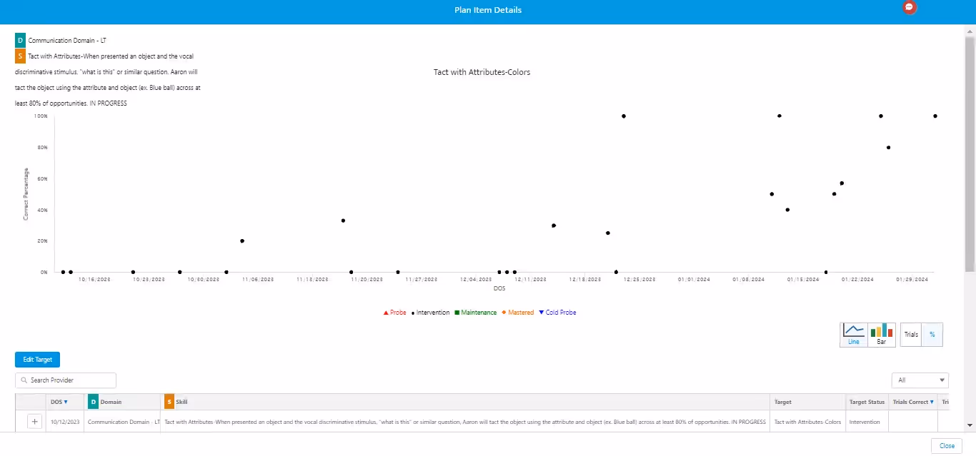
The experts at Artemis ABA understand the significance of graphing and visual data analysis in crafting tailored plans for each child's unique needs. That’s why Artemis developed a robust data collection software that allows ABA clinicians to record diverse ABA data types and create customizable fields.

On the Artemis platform, each client has a single, unified dashboard and can easily move from module to module, such as data collection, reporting, visual analysis, and session notes. Filter different data types, plot across dates, and toggle between graph types to create the best visual to help you interpret the data and make informed treatment decisions. Once you’re ready to submit a claim, simply create a graph and report, customize it as you want, and generate a PDF that you can directly submit to your payer.

Unlike other practice management software, Artemis handles everything ABA. Their end-to-end software is a single, tight, unified solution that means nothing will fall through the cracks—you can effortlessly collect, graph, analyze data, and prepare reports, all within the same portal. Elevate your ABA clinic by partnering with Artemis.

Keep Up to Date on ABA Practice Management Best Practices

Subscribe and stay updated with the latest announcements, information and more.

Discover More
ABA Prompts: Types, Examples and Data Templates
ABA Session Notes: Components, Examples, Templates and Expert Tips
ABA Graphs and Visual Analysis: Types, Elements, and Examples
ABA Discontinuous Measurement: Types, Examples, and Data Collection Strategies
ABA Continuous Measurement: Types, Examples, and Data Collection
ABA Frequency Measurement: Recording, Graphing, and Automating
ABA Duration Measurement: Recording, Calculating and Tracking
BCBA and RBT Burnout: Signs, Factors, and Solutions for ABA Professionals
ABA Behavior Intervention Plans: How to Write, Examples and Template
Discrete Trial Training Data Sheets: Free Templates and Best Practices
Marketing Your ABA Practice: Ethical Guidelines, Marketing Channels, and Expert Tips
How Can ABA Practice Management Software Improve Your Practice?
ABA SOAP notes simplified: How-to, expert advice, and templates
Does your ABA therapy clinic need practice management software?
Starting an ABA Therapy Clinic – Step by step how to, ABA Business Plan and Checklist
ABA Data Collection: Methods, Tips & Tech
What is ABA Practice Management Software ?
Practice management software: Enabling digitization of ABA practices
Creating An Efficient ABA Practice With Artemis

Katherine Jester, MS, BCBA, LBA

Clinical Technical Solutions | Board Certified Behavior Analyst & Mental Health Therapist 

Katherine Jester is a Michigan-based BCBA and mental health therapist with 10+ years of experience helping diverse clinical populations. Katherine completed her graduate work at the University of Michigan and has had the privilege to work with incredible kids and families in both residential treatment and outpatient clinic settings. She is proud to support the clinical development of Artemis ABA, and enjoys working with Applied Behavior Analysis (ABA) practice stakeholders to put time and flexibility back in the hands of their teams.